Arquitectura y Concreto website
Helping people achieve the dream of owning their own home by simplifying the search and purchase process through an innovative website.
Client: Arquitectura y Concreto
Role: Senior UX
Proyect type: Web site
Duration: Q2-Q3 2020

About the Project:
Arquitectura y Concreto is one of the most important construction companies in Colombia, with a tradition of more than 30 years helping in the construction of the dreams of many Colombians.
The company approaches us with the need to renew its website, turning it into a tool to increase traffic and effective sales, generating communication strategies and contact with its target audience.
In this project we address the entire process of user-centered redesign, through discovery, definition, ideation and implementation.
Project Goal
Increase website traffic at the TOFU by 30%, achieving at least 5% conversions in lead generation.
My role
As a Senior UX Analyst, my primary responsibilities involved comprehending the business context, user needs, and market trends. This knowledge enabled me to provide essential guidance to both the team leader and client stakeholders about the project’s final user experience.
My Functions as Senior UX Analyst:
- Design Thinking Workshops: Planned and facilitated workshops to foster creative problem-solving.
- Benchmarking: Conducted thorough market and competitor analysis.
- UX Research: Undertook user research to inform design decisions.
- Information Architecture: Developed the structural design of shared information environments.
- User Flows: Created user flow diagrams to outline the user journey.
- Navigation Mapping: Designed intuitive navigation maps for ease of use.
- Interaction Design: Focused on crafting engaging user interactions.
- Wireframes: Developed wireframes for both desktop and mobile platforms.
This project was worked with a multidisciplinary team: 1 team lead, 1 Seo Analyst, 1 UX Analyst, 1 UI Designer, 1 UX Writing, 1 Backend, 2 Frontend, 1 QA
This is how we solved it
The discovery phase was pivotal in understanding Arquitectura y Concreto’s business environment, user needs, and market trends. We employed user research and market analysis to identify key challenges and opportunities, laying the groundwork for a user-centric design strategy. This initial stage was instrumental in informing our design direction and ensuring alignment with the company’s objectives.
Kick off
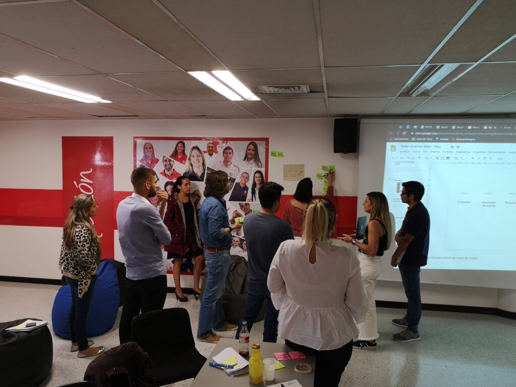
During the initial phase, I led three workshop sessions with the client and our team to align expectations and understand the project scope. Key focuses included:
- Expectation Alignment: Ensuring mutual understanding of project goals.
- Business Objectives: Clarifying the business aims driving the project.
- Defining User Segments: Identifying target user groups.
- User Stories Map: Developing a map of user stories to guide our design process.
- Data Acquisition: Receiving relevant business data for informed decision-making.
This stage provided a solid foundation for the project, offering clarity on objectives and user insights.
User research
In this phase, we analyzed the client’s existing user data, including market research, analytics, buying habits, and pain points in home purchasing. We also conducted desk research on real estate users in Colombia. This comprehensive analysis led to the creation of distinct user personas:
- National Investor: Focused on domestic investment opportunities.
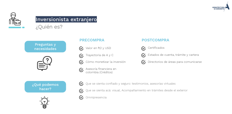
- Foreign Investor: Interested in investing in the Colombian market.
Traditional Home Buyer: Seeking residential properties. - External Advisors: Providing expert advice in the real estate domain.
- Commercial Sales Force: Representing the client’s sales perspectives.
This in-depth understanding of different user groups was crucial for tailoring our design strategy to meet diverse needs and preferences.
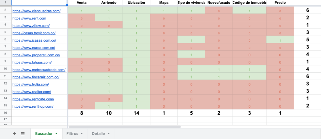
Benchmark
In our competitive analysis, we concentrated on understanding the key experiences users encounter when searching for properties online. Our focus was on evaluating:
- Housing Search: How users navigate and search for properties.
- Filters and Property Comparison: The effectiveness and user-friendliness of search filters and comparison tools.
- Detail View of Each Property: The quality and comprehensiveness of information presented in individual property listings.
This analysis allowed us to identify best practices and areas for innovation in online property search functionalities.
From problem to tangible solution
With a clear understanding of the problem’s cause, we begin the design process using artifacts such as information architecture, co-creation workshops, low-fidelity explorations, and UI.
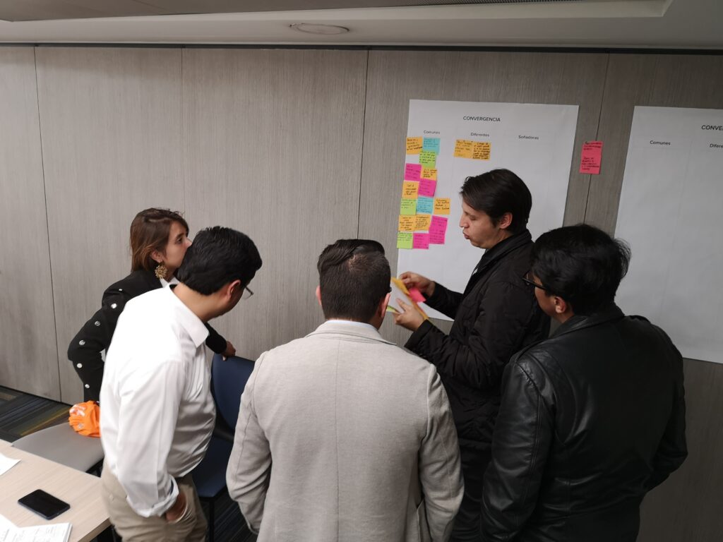
Ideation Workshop
Leveraging the insights from the discovery phase, we embarked on a co-creation journey to realize the client’s vision for their new portal. This process was deeply informed by the needs of diverse user groups and the trends identified in our benchmark analysis.
The outcome of this ideation workshop was a list of prioritized functionalities, serving as a foundational guide for the initial stages of the experience design.
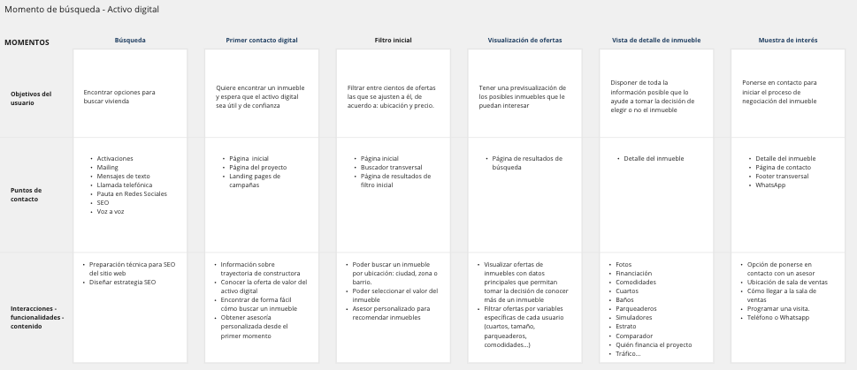
Information Architecture:
In conceptualizing the user experience, we developed a navigation flow that highlighted the key sections a user would navigate through to achieve a conversion on the website. This flow included detailed variables for each section, aiding our understanding of the necessary content and functionalities for each screen:
- User Goals: Identifying what the user aims to achieve at each stage.
- Contact Points: Mapping out where users interact with the website.
- Content/Functionalities: Determining the type of content and features needed on each screen.
This approach ensured a user-centric design, facilitating a seamless and intuitive journey towards conversion.
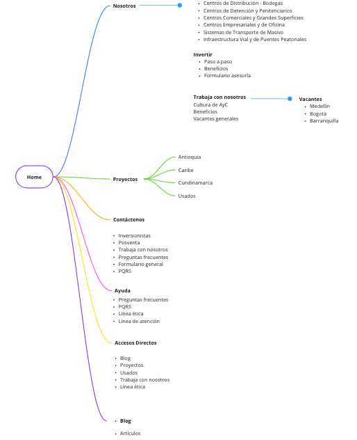
Navigation Map
With a clear list of functionalities and contents, we began to group the information in a logical and clear way for the different identified users, generating the navigation map for the website.
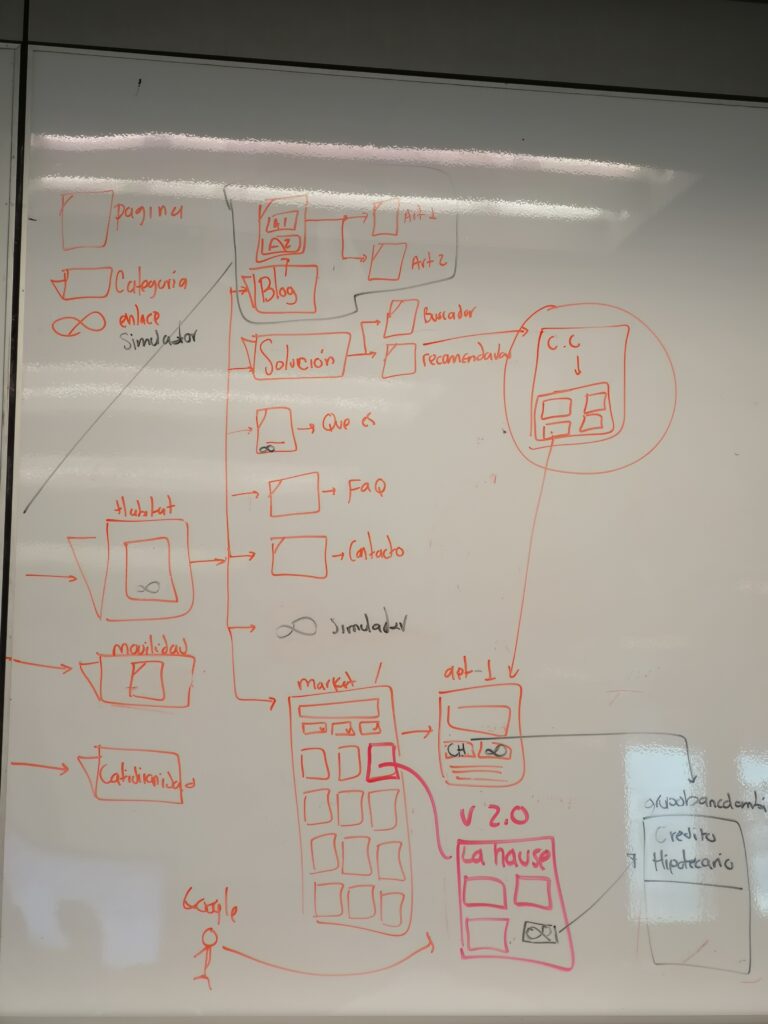
Low-fidelity explorations:
The established information architecture guided us into the interaction design phase, where we focused on wireframing to incorporate key findings from earlier stages.
The primary challenge was balancing the client’s expectations with the users’ needs. In this wireframing process, our design team conducted workshops to define the requirements for low-fidelity wireframes.
These initial sketches were then refined using Adobe XD, resulting in wireframes that effectively communicated the purpose of each screen.
Hi fidelity
Following the co-creation sessions with the design team, we advanced the drafts into high-fidelity wireframes. This step was crucial for conveying the experience concept clearly, first to the development team and subsequently to the client for approval. These detailed wireframes served as a definitive guide for both development and stakeholder review.

A fresh color palette aligned with the brand's identity
The final design emerged from a collaborative and iterative process involving the design team, regular validations with the development team, and incorporating feedback from the client’s stakeholders.
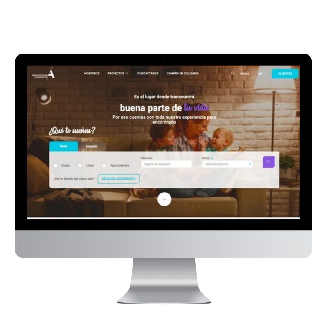
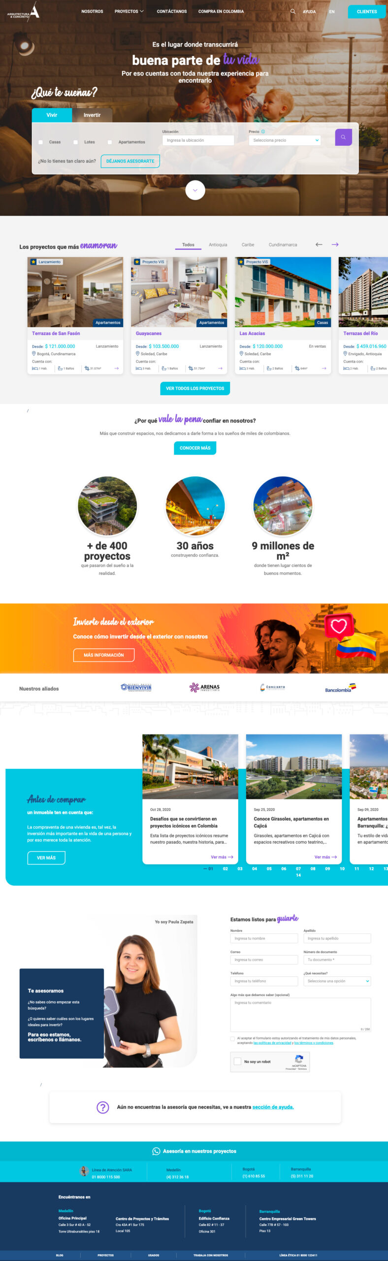
The resulting concept presents a fresh, modern website, characterized by contemporary colors and typographic choices that evoke a sense of tranquility and a welcoming atmosphere.
New UI
Work With Me
If you liked what you saw and want to enhance your digital products, don’t hesitate to message me on WhatsApp.