Report Configuration
Simplifying business management for Mercado Pago sellers by redesigning the sales report configuration options. (2023)
Client: Mercado Pago
Role: UX Project Lead
Proyect type: Redisign
Duration: Q2-Q3 2023

About the Project:
Mercado Pago, part of the Mercado Libre group, leads in digital payment solutions in Latin America. It offers a range of services including online payments, money transfers, and financing options.
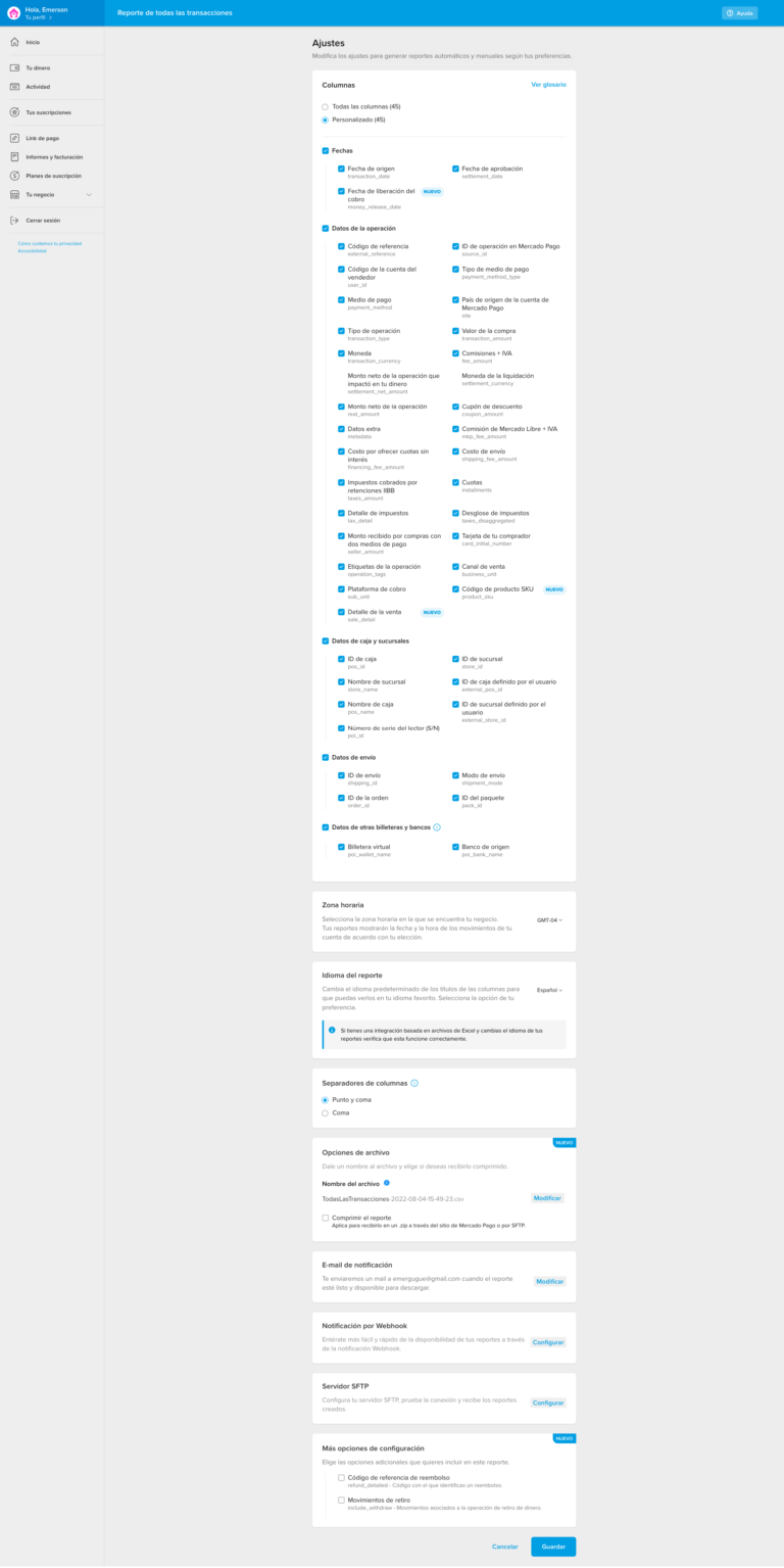
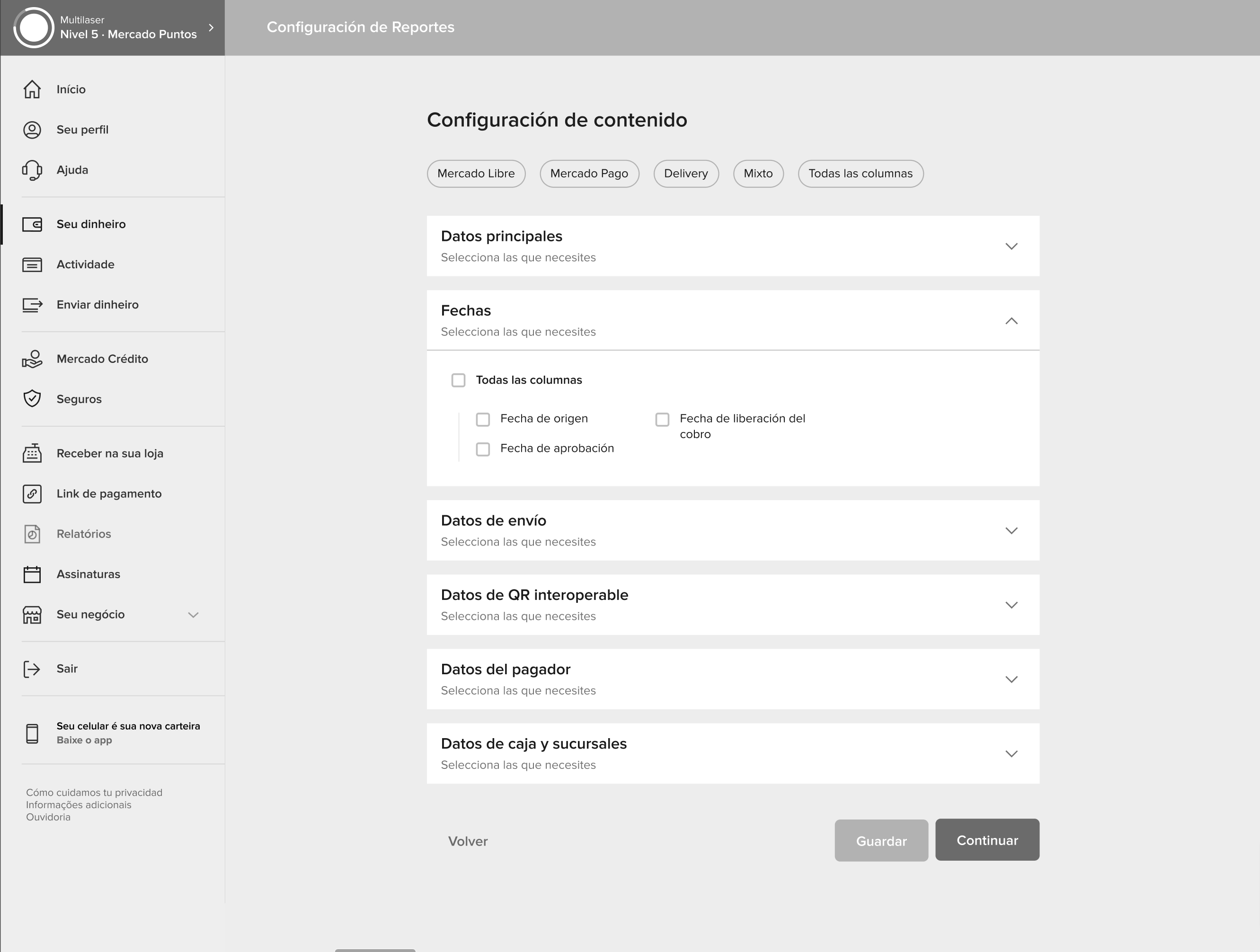
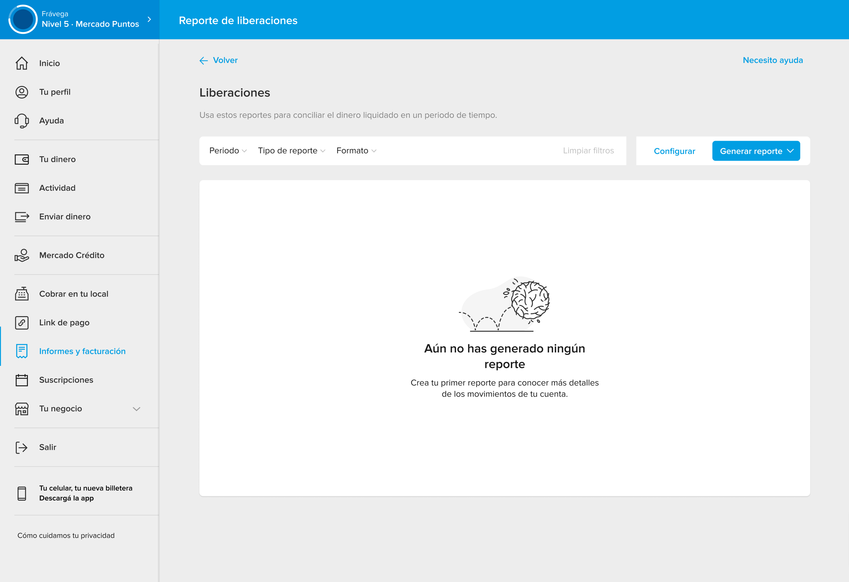
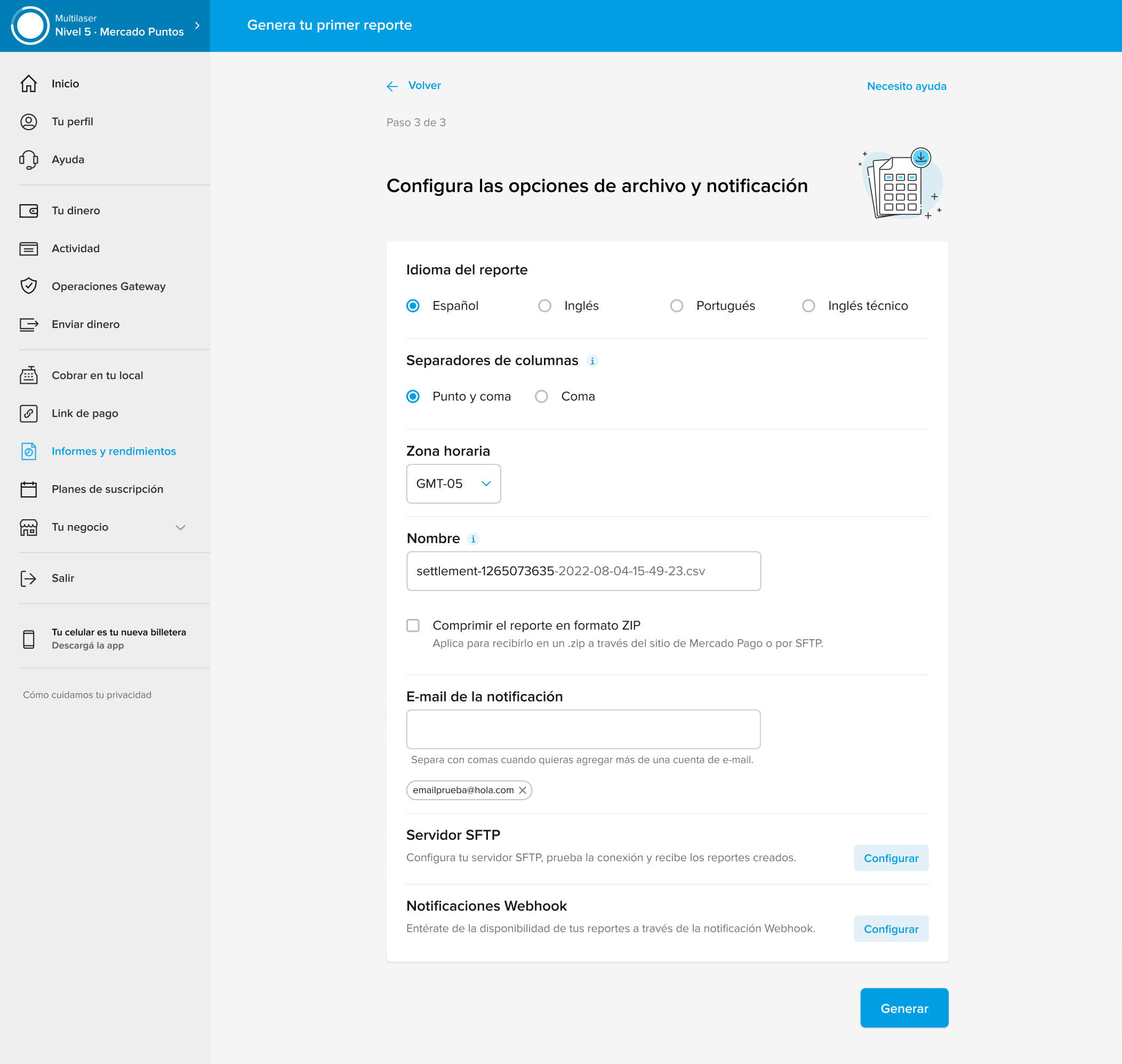
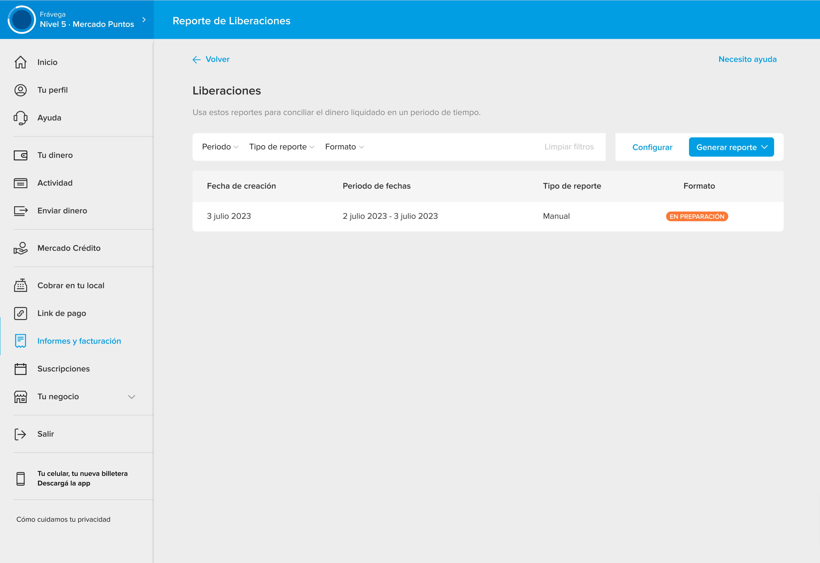
A notable feature is its reporting section designed for sellers, where they can generate detailed spreadsheets of their sales. Depending on the business, these reports can include up to 50 columns, with options to customize the content and other settings.
However, Mercado Pago’s support team was receiving between 500 to 600 monthly contacts due to two reasons:
- The complexity of the reports: the large number of columns made them difficult to understand.
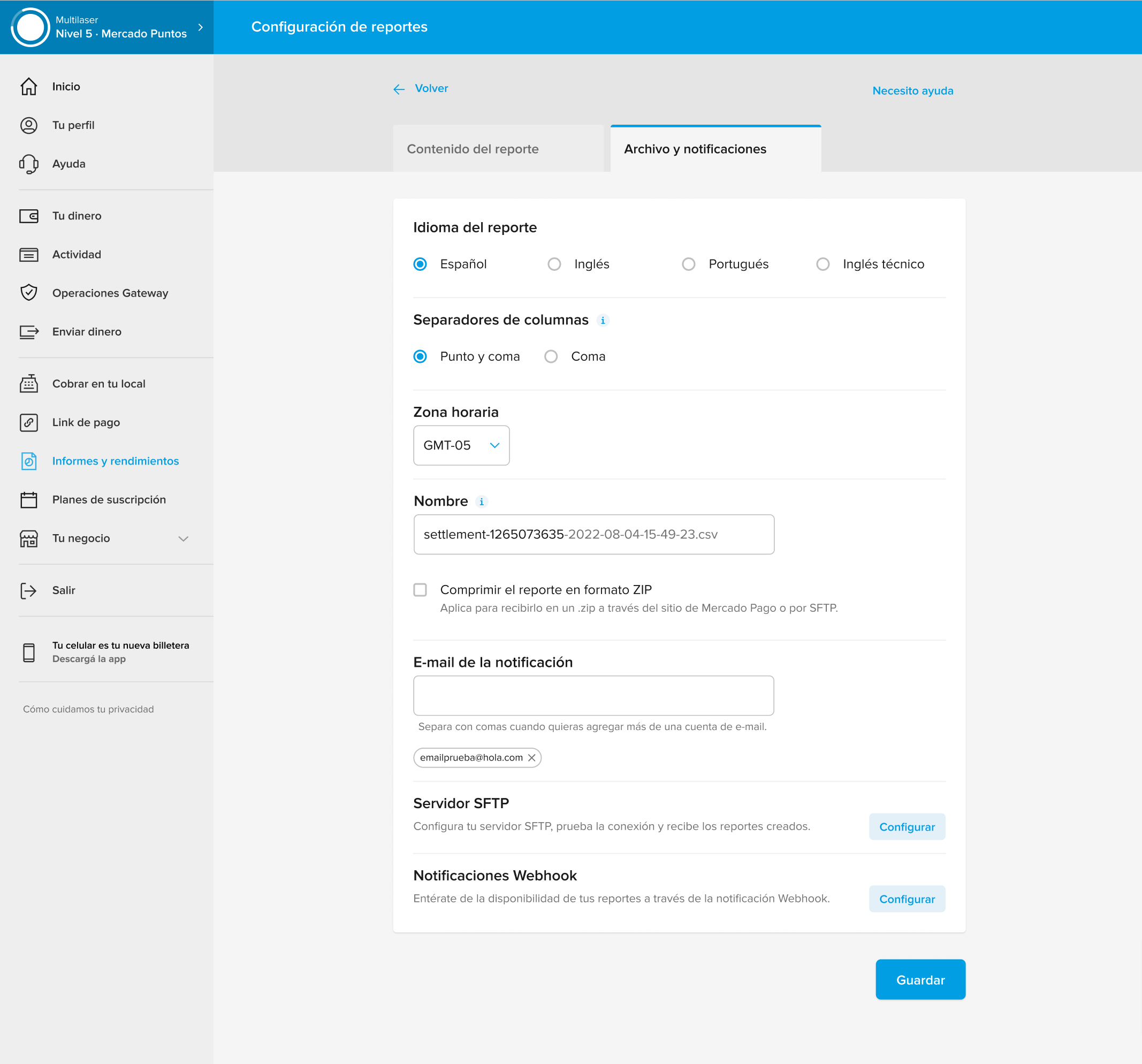
- Report language: the file was generated in technical English, which was not easily comprehensible for users.
Both issues could be resolved from the report settings page, yet users were not utilizing these options.
Project Goal
To reduce support team inquiries related to the complexity and language of the reports, aiming for an 80% decrease in these specific categories within the first three months of being operational.
My role
As the UX Project Leader, I assumed critical responsibilities crucial for the team’s and project’s success:
- Objective Definition: Supported the team in setting clear UX-focused goals.
- Methodological Guidance: Led the team in using user-centered design methods.
- Technical Leadership: Maintained high-quality standards for deliverables.
- Stakeholder Communication: Managed discussions to ensure alignment and progress.
- Strategic Negotiation: Handled negotiations to define timelines and scopes.
- Task Management: Coordinated task distribution to optimize productivity.
- UX Research Objectives: Worked with the research team to define impactful research goals.
- Design Standards Application: Ensured adherence to the design system and guidelines.
This project was carried out with a multidisciplinary team comprising: 1 UX Project Leader, 2 UX Designers, 1 UX Writer, 1 UX Researcher, 1 Product Manager, 1 Development Leader
This is how we solved it
To tackle this project, we adopted a methodological approach divided into two key phases, focusing on understanding and solving the problem:
1. Understanding and deepening the problem phase:
Objective: Our initial aim was to thoroughly comprehend the issue at hand.
Actions: We executed an in-depth analysis to pinpoint affected users and grasp the specific circumstances leading to the problems. This encompassed scrutinizing usage metrics of the report section and evaluating data from the support team.
Expected outcome: A detailed and clear grasp of the challenges encountered by users, encompassing the contributing factors and scenarios.
2. Conceptualization and solution proposal phase
Objective: The focus at this stage was to develop an effective solution.
Actions: We utilized co-creation techniques, collaborating with Product, development, and stakeholders to brainstorm and prototype solutions. This phase involved conducting benchmarking, information architecture, brainstorming sessions, prototype design, and iterative testing to refine the proposal with real platform users.
Expected outcome: A well-defined and validated solution that directly addresses the identified issues, enhancing user experience and reducing related support inquiries.
Hypotheses
After analyzing the usage metrics and support team data, we have developed two main hypotheses to explain the difficulties that sellers are experiencing:
- Findability: The section for configuring reports is not easily accessible from the main Reports screen. The current location may be contributing to users not efficiently using this function.
- Usability: The report configuration page has a cluttered design with a large amount of content and options that are not intuitively organized. This could be hindering users from customizing their reports effectively and quickly.
These hypotheses will help us focus our improvement strategies on the areas of accessibility and interface design to enhance the user experience.
From problem to tangible solution
With a clear understanding of the problem’s cause, we begin the design process using artifacts such as benchmarking, information architecture, co-creation workshops, low-fidelity explorations, and user testing.
Benchmarking
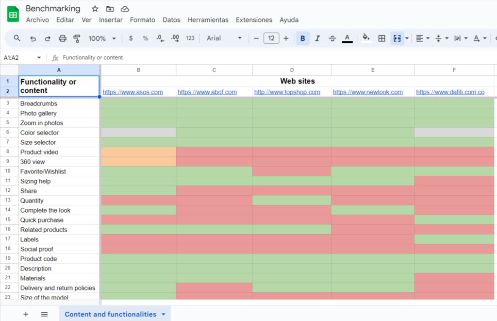
We researched how other entities in the fintech sector, as well as companies from other relevant sectors, handle the generation and configuration of reports. This analysis helped us understand market practices and identify potential areas for improvement for Mercado Pago.
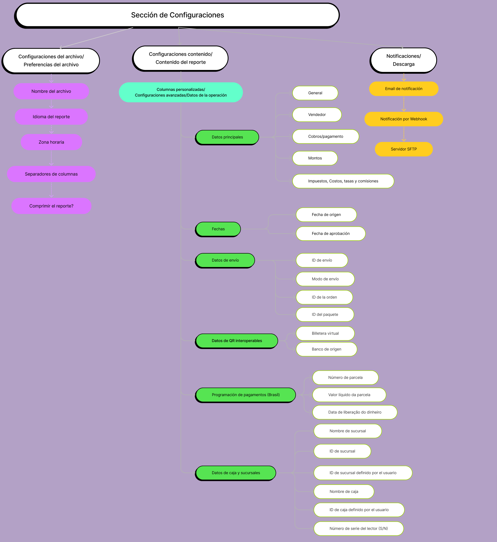
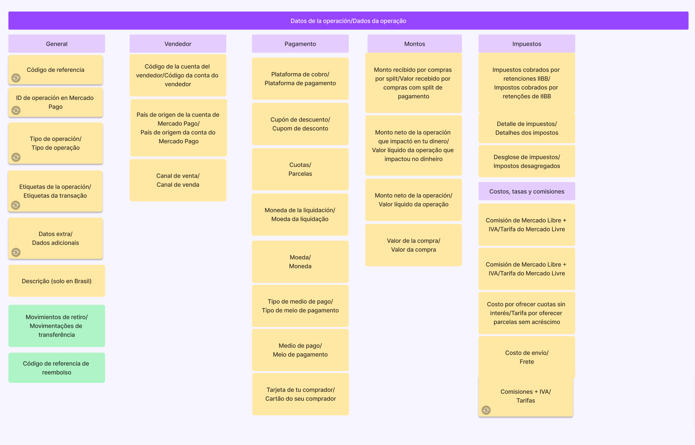
Information Architecture:
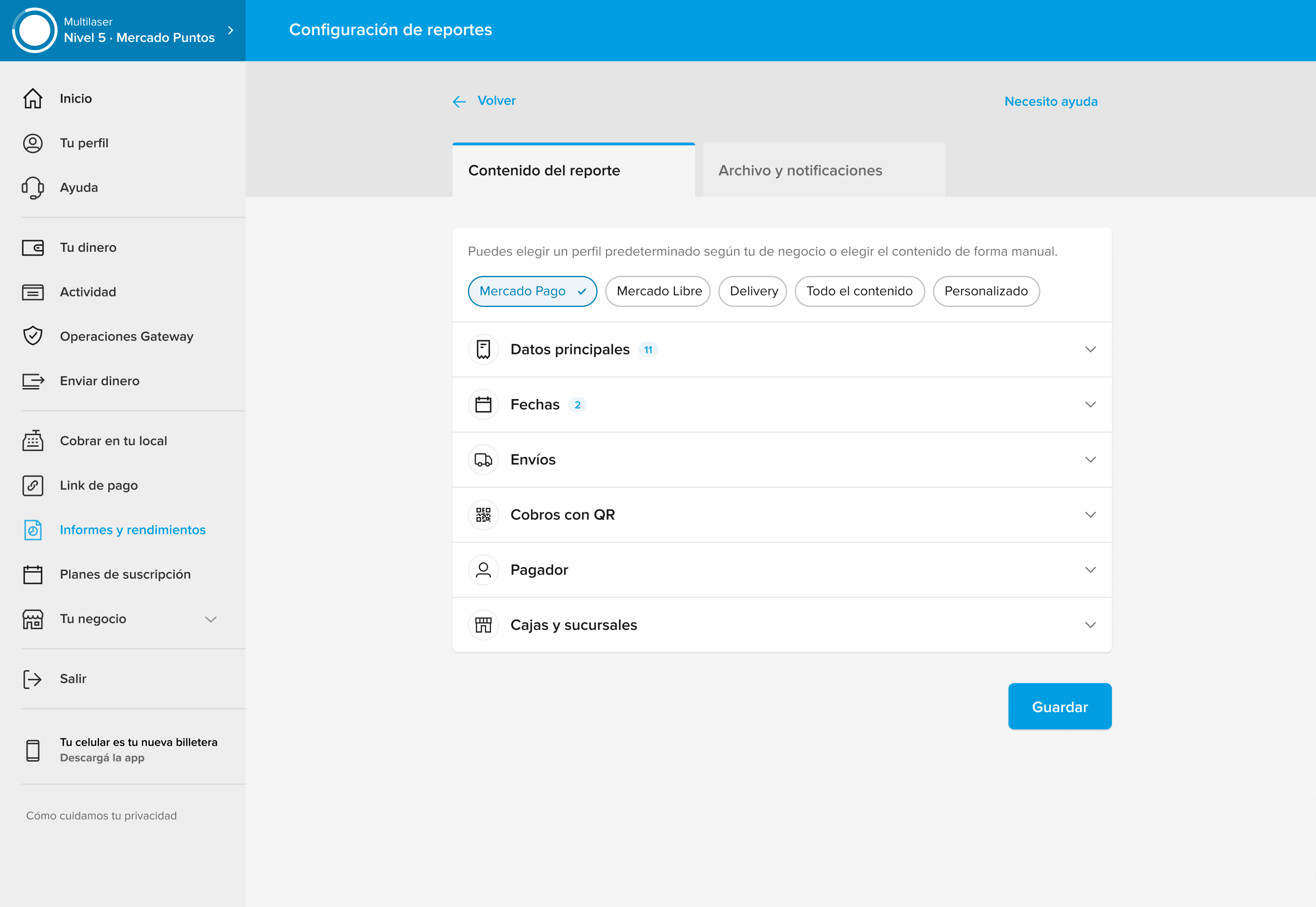
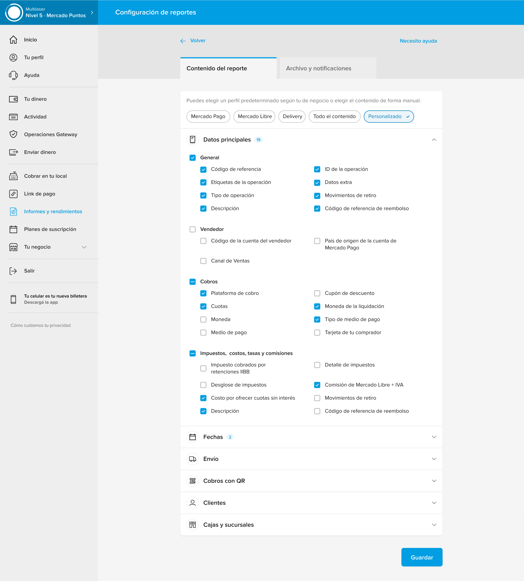
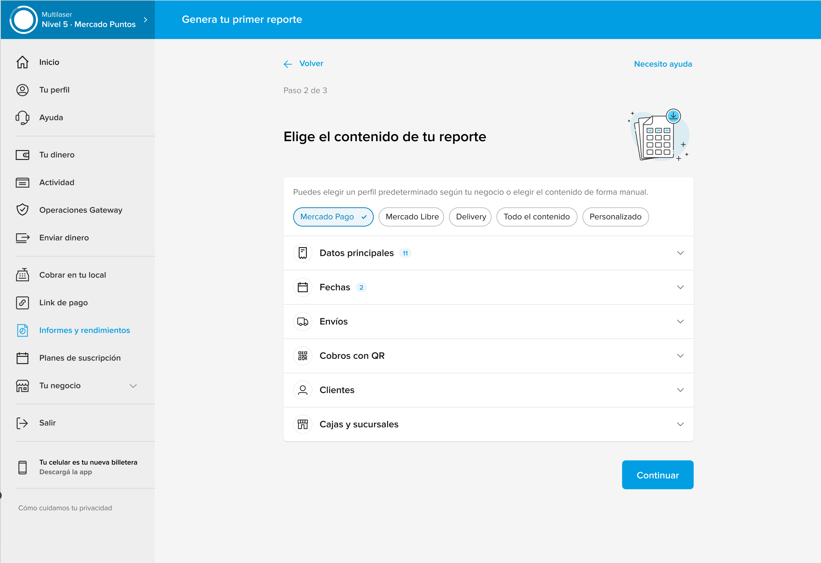
Due to the extensive amount of information in Mercado Pago’s reports, it was necessary to create order and grouping to facilitate report customization.
Card Sorting: Given the extensive amount of information in Mercado Pago’s reports, it was crucial to structure it in a way that would facilitate customization. We conducted an unmoderated remote card sorting with 17 small and medium-sized business sellers. This provided valuable insights into users’ mental models for organizing information.
Grouping Proposal: Based on the results of the card sorting and the technical knowledge of our team, we developed a logical structure that aligns the different report configuration options with users’ mental models.
Co-creation:
After defining a solid Information Architecture, we organized two co-creation workshops with the design, development, and product teams. The goal was to generate initial ideas on how to improve the report configuration experience.
Low-fidelity explorations:
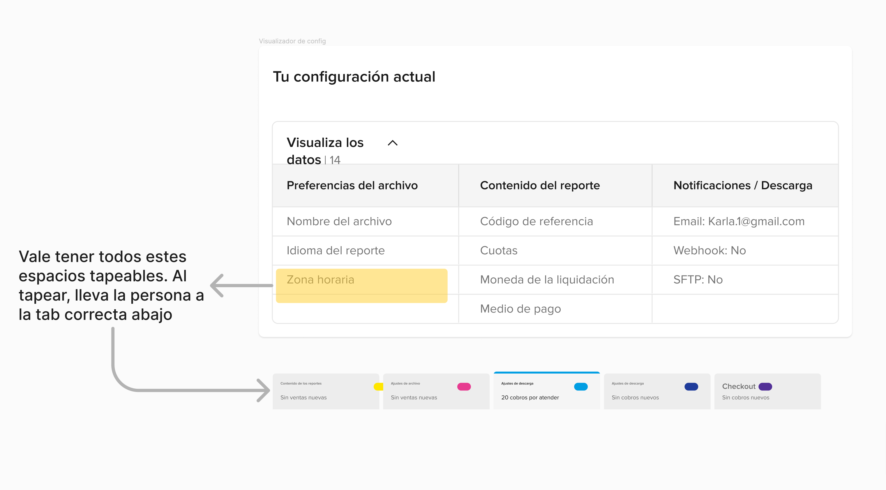
With the ideas generated in the workshops, the design team began sketching low-fidelity proposals. This allowed us to materialize the ideas and decide which ones were feasible and which ones needed to be discarded.

User Validation:
To choose the final proposal, we conducted moderated validation sessions with users. We presented them with the different proposals, observed their usage, and assigned specific tasks. We measured usage times and collected feedback, which led us to identify the proposal with the best performance.

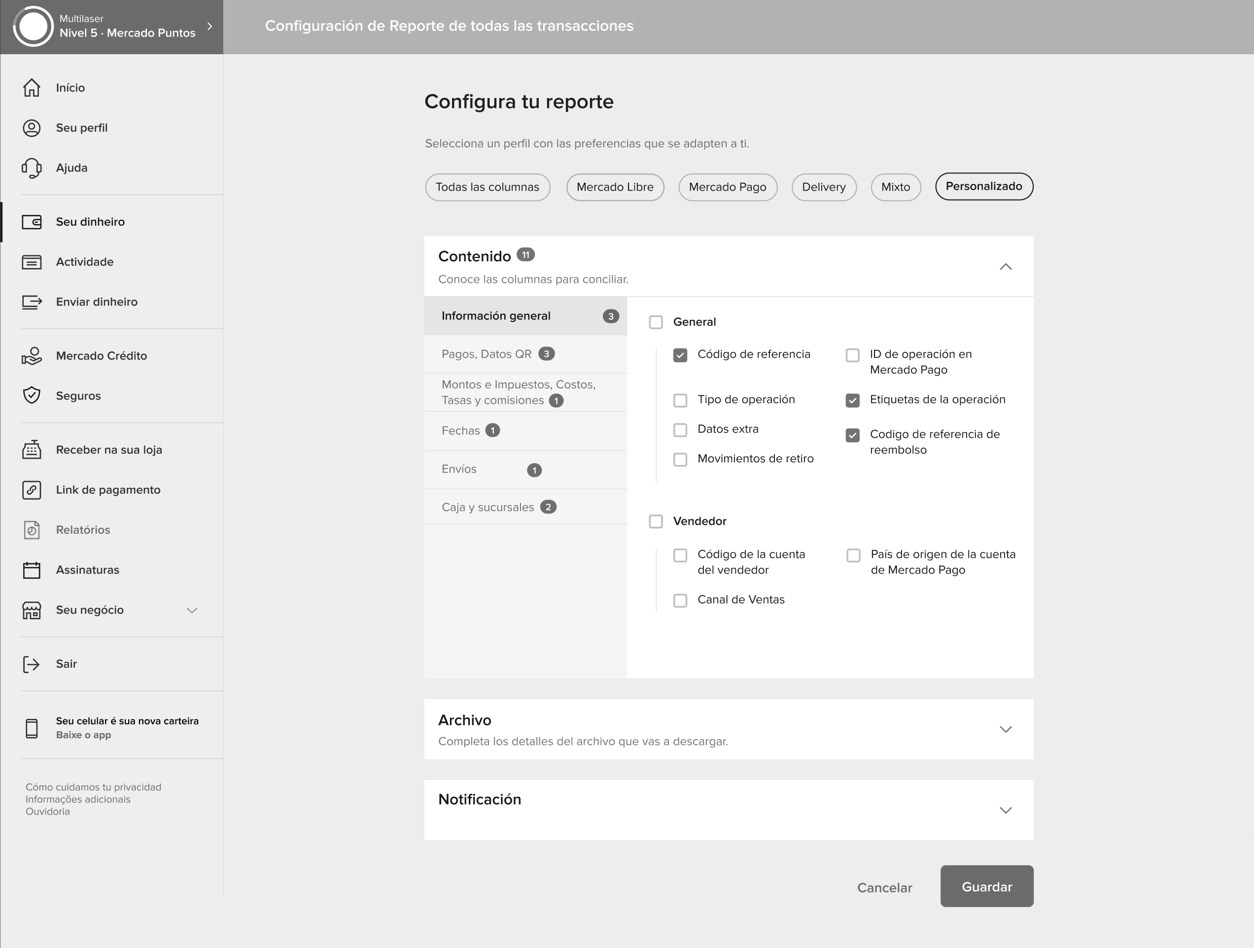
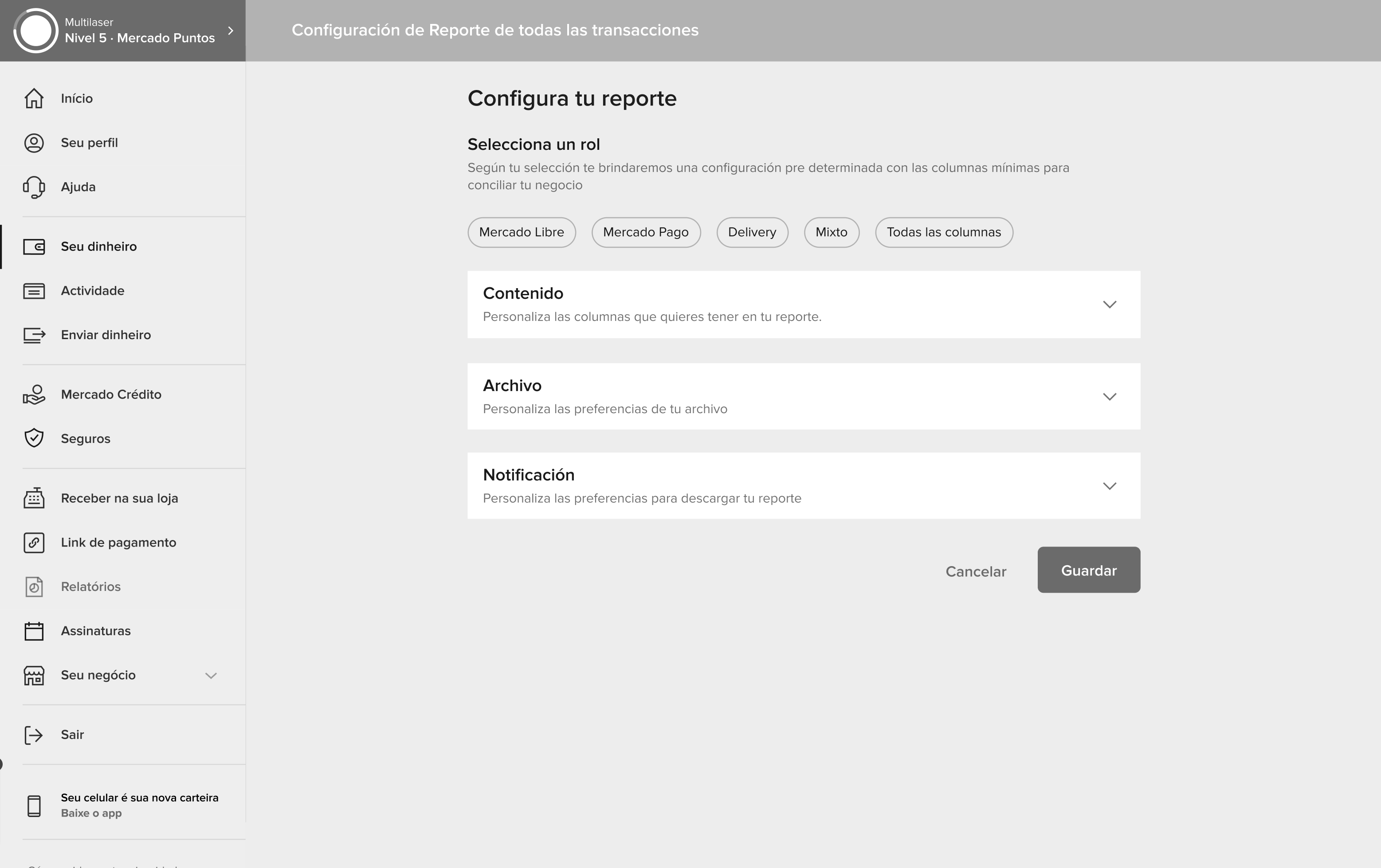
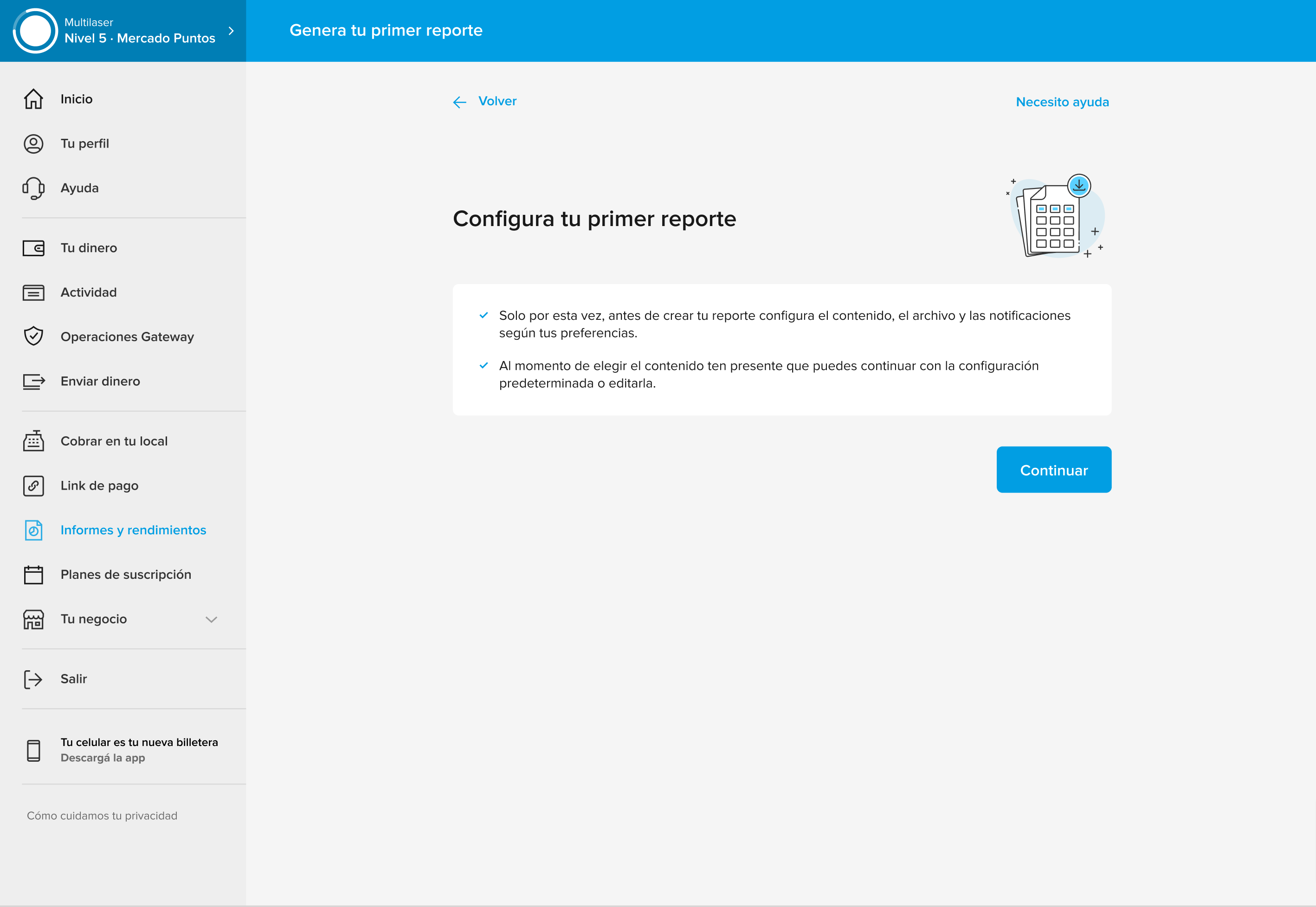
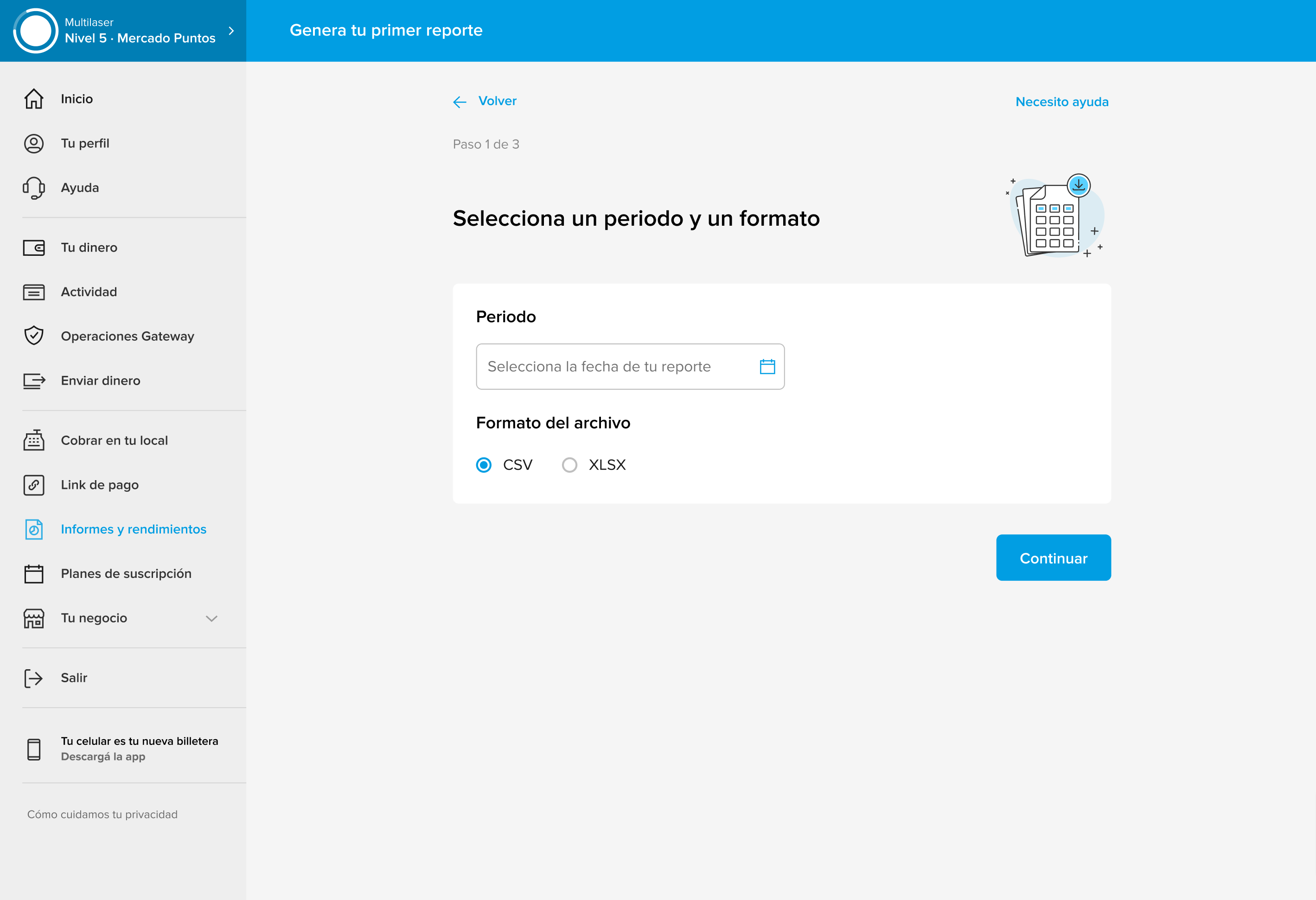
From problem to tangible solution
With user validation, we moved on to creating a high-fidelity visual proposal. This set the stage for the handoff to the development team, with the goal of implementing the solution throughout 2024.
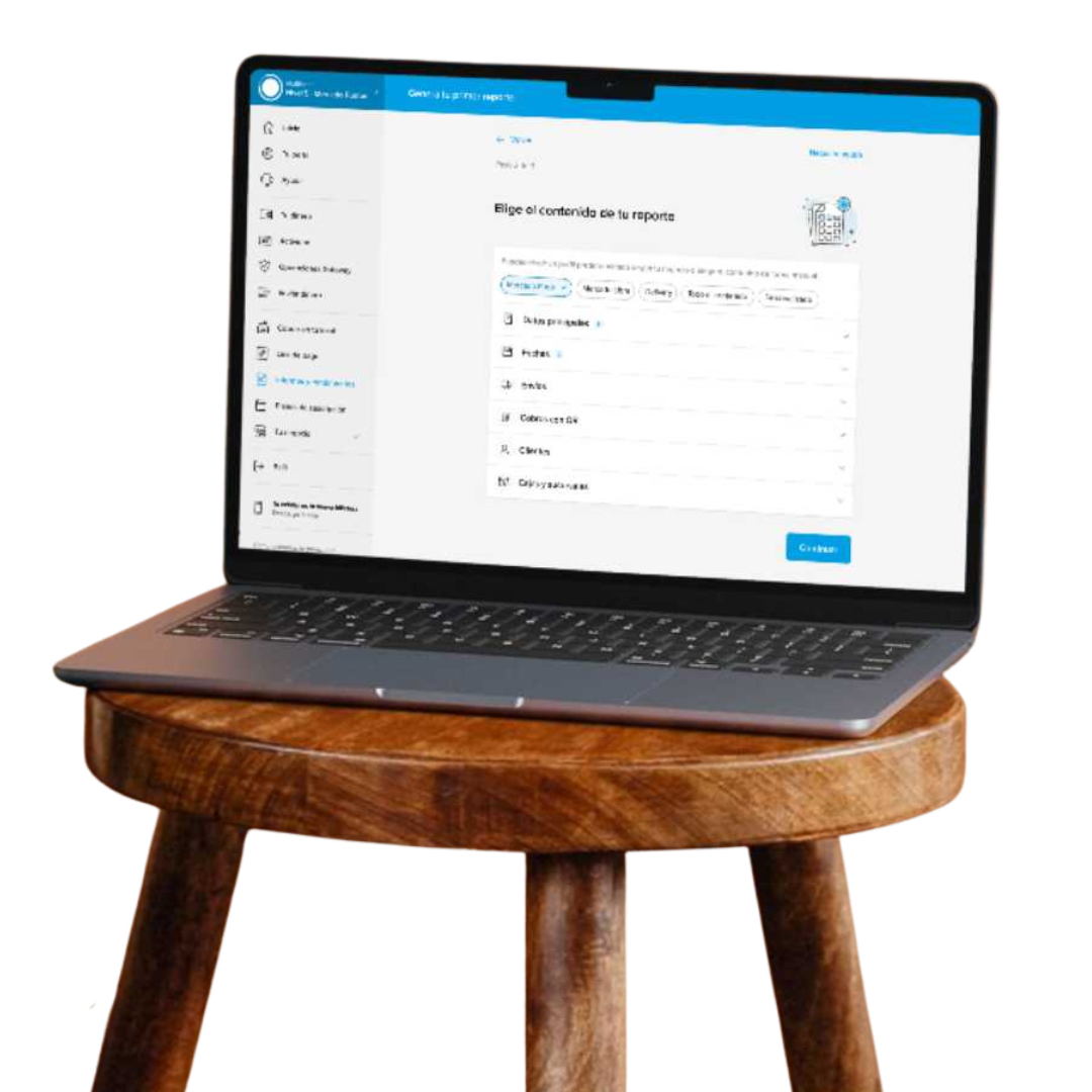
New UI
FTU (First time use)
Work With Me
If you liked what you saw and want to enhance your digital products, don’t hesitate to message me on WhatsApp.